

ZTRON

06 / Brand identities & design

Look different. Feel unmistakable.

We shape identities that connect digital experiences and physical touchpoints, with clarity, personality, and consistency.

Identity in form

A visual language, made tangible.

Original marks, thoughtful typography, and the interface details that make a product feel like itself.

VEDIC.world identity illustration with its original mark on a white rounded tile and soft sage, cream, and lavender geometric shapes.

Identity

The original VEDIC.world mark gives the learning and reflection space a recognizable visual signature.

Color & type

Forest, sage, cream, and gold pair an editorial serif with Geist for clear interface text.

Digital expression

The visual language carries through reading, personal practice, reports, and Apoorva AI conversations.

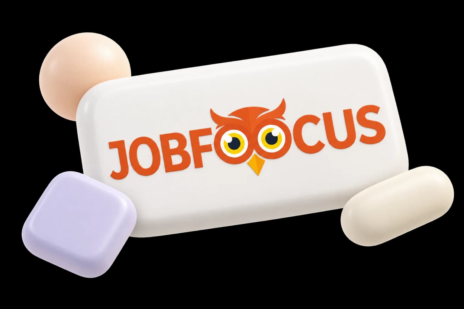
JobFoocus identity illustration with its original owl wordmark on a white rounded tile and soft peach, lavender, and cream geometric shapes.

Identity

The original owl mark and JobFoocus wordmark give the application workspace its distinctive signature.

Color & type

Warm white, orange, and brown work with Nunito Sans to keep the interface friendly and readable.

Digital expression

The identity connects the landing page, resume editor, and application workspace through consistent type and interface details.